Photo by 五玄土 ORIENTO on Unsplash
Every restaurant has a story to tell — and many of them tell their stories through the medium of their logo.
This makes sense. Logos are the representation of the restaurant; they’re the most immediate way to identify a brand or company.
They’re also intended to send a message to the viewer.
That message encapsulates the restaurant, bundles it up in a neat little package, and tells the diner what they can expect. That makes logos the perfect way to tell a story, especially for Chinese restaurants.
Chinese food is some of the most popular cuisine in the world, though what you can expect varies from region to region and country to country. The food also reflects a history rich in culture and meaning — and those details are often included in the lettering and graphics chosen for the Chinese restaurant logo.
Here are ten well-known Chinese restaurant logos and a little bit about the meaning behind them.
Newport Tan Gang

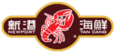
Newport Tan Gang Seafood Restaurant is a very well-known dining place in the San Gabriel Valley in California. It is especially known for its lobster dishes — and that’s clearly what influenced the graphic choice in the logo.
The logo for Newport Tan Gang also includes the name of the restaurant in both Chinese characters and English. The color choices are muted reds and yellows — a more grown-up, unusual take on the ever-present bright red and gold that is often seen in Chinese restaurant decor.
Tropical Chinese Restaurant

The Tropical Chinese Restaurant in Miami, Florida, is built around a classic take on Chinese decor and food, and the logo is a great representation of that. It’s a stylized Chinese lantern, which makes for both an appealing logo and very clear messaging of what to expect.
Legend Seafood Restaurant

Legend Seafood Restaurant is an authentic Cantonese restaurant based in Honolulu, Hawaii. It prides itself on a comfortable, appealingly relaxed atmosphere — and, of course, a wide variety of seafood dishes.
The fish and ocean graphic in the logo perfectly reflects what the restaurant offers, as well as giving an affectionate nod to the location in Hawaii. Fish icons are also traditional choices for seafood restaurant logo designs. The color choices, yellow and green, are noteworthy and stand out from other logos in the same genre, which is ideal for a restaurant that wants to make its mark.
Lao Sze Chuan

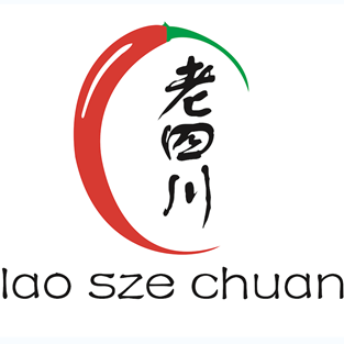
This Chicago-based restaurant has garnered dozens of accolades and made it to the number one spot on a score of nation-wide “Best Chinese Restaurant” lists. The restaurant prides itself on offering authentic Sichuan cuisine in a range of tastes and flavors — including chilies and spice.
That’s the inspiration for the skinny red chili that nearly completely encloses the Chinese characters of the restaurant’s name in the logo. Much like the striking and acclaimed food served by the restaurant, the logo is bold and memorable.
Beijing Pie House

Beijing Pie House is probably the most famous Chinese restaurant in Monterey Park area — it even made CNN’s list of some of the best Chinese restaurants in the United States. It’s a mainstay for exactly what it’s named for — pies.
Not sweet pies, of course, but savory meat pies. And the logo gives a subtle nod to that, with an outlined circle around the edge. It uses red, white, and black for its simple palette; and the Chinese characters are included as well as the English translation of the restaurant name. The logo is very simple but memorable — just like the dish that the restaurant is known for.
Xi’an Famous Foods

Xi’an Famous Foods, based in New York, offers Western Chinese dishes that also have Muslim inspirations at the roots. For all the melding that is involved in the menu and cooking itself, the logo is simple: slightly-stylized Chinese characters enclosed in a white box. Simple is often the best choice, and this logo doesn’t distract from the real draw of the restaurant: the unique flavor combinations.
Sun Shui

This fun, outdoors-inspired logo includes line drawings of mountains, the sun, and waves — all nods to the roots of the food that the menu offers, as well as the name of the restaurant itself.
Interestingly, the restaurant is built around a mix of cuisines: both more traditional Chinese food and Japanese sushi. The simplicity of the logo allows for nods to both of those inspirations.
Joyful House

This wordmark logo is a modern, quirky take on the more traditional “English font combined with Chinese characters” typography that is often seen in Chinese restaurant logos. The unique font choice reflects the modern variations on authentic Cantonese dishes that are offered by this Las Vegas dining experience.
Shandong

This restaurant offers a casual, fun, friendly atmosphere with “cutting edge” takes on traditional northern Chinese cuisine. The logo is done in red and white, giving it a traditional nod; at the same time, the stylization of the characters gives the logo a fun, youthful feel, perfectly fitting the restaurant that sports it.
Han Dynasty

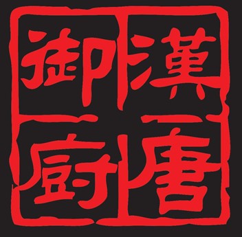
Han Dynasty, in Philadelphia, goes big on the red — a traditional choice for Chinese decor and graphic design, but also an excellent way to suggest that the food is spicy. (And, according to the psychology of color, a great choice to stimulate appetite!) Along with the outside and inside of the restaurant itself, the logo is done on a black field with a brilliant red traditional-style wordmark design. Just like the food that the restaurant offers, the logo is eye-catching and striking.
Telling the Story
Of course, there’s far more to any restaurant’s story than can ever be completely captured in the logo. But these brief snippets of the inspiration behind these great Chinese restaurant logos just go to show how much you can tell about a restaurant, when you stop to look at the logo.
Author Profile
David Anderson is a business graduate with a marketing major. He specializes in communication design and has helped many brands achieve their goals in marketing communication. Now he writes for freelance clients on topics related to brand design, visual communication, and marketing.

